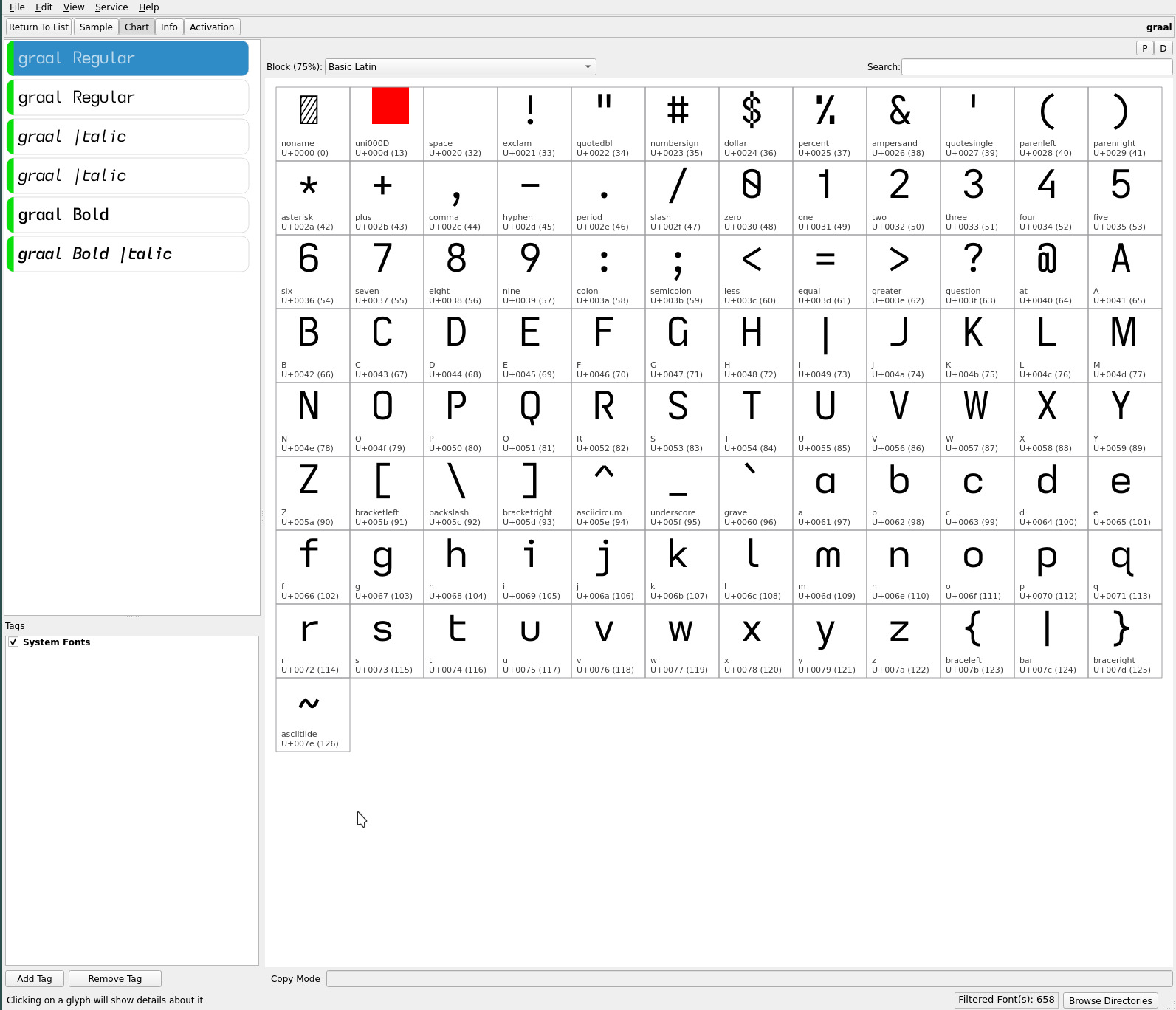
the holy graal
the groot font has recently found favour as my go to ereading font with its singular descending caps I flair—the signature glyph that dominates my reading and writing typefaces. It was only a matter of time before the single storey lower case a would find its way into this “flat” glyph set. Enter the graal** font..

**Archaic spelling :)
asymmetric t
variants of both the groot and graal fonts now inherit the asymmetric lower case t. This glyph escaped me during the elimination of symmetric glyph shapes—the lower case t being similar (though not as evident as the lower case b d p q and n u glyph shapes) to the lower case f glyph shape (rotated and flipped). Differing x height positioning of the crossing strokes is distinctive but the asymmetric t should hold the edge for impaired vision dyslexia (where the non-descending lower case f is concerned).
It is an uncommon glyph but i have personally taken a liking to it—its non-crossing stroke aligning with my drive for ever cleaner and more minimalist glyph shapes. groot remains my current default ereading font. As always, YMMV.
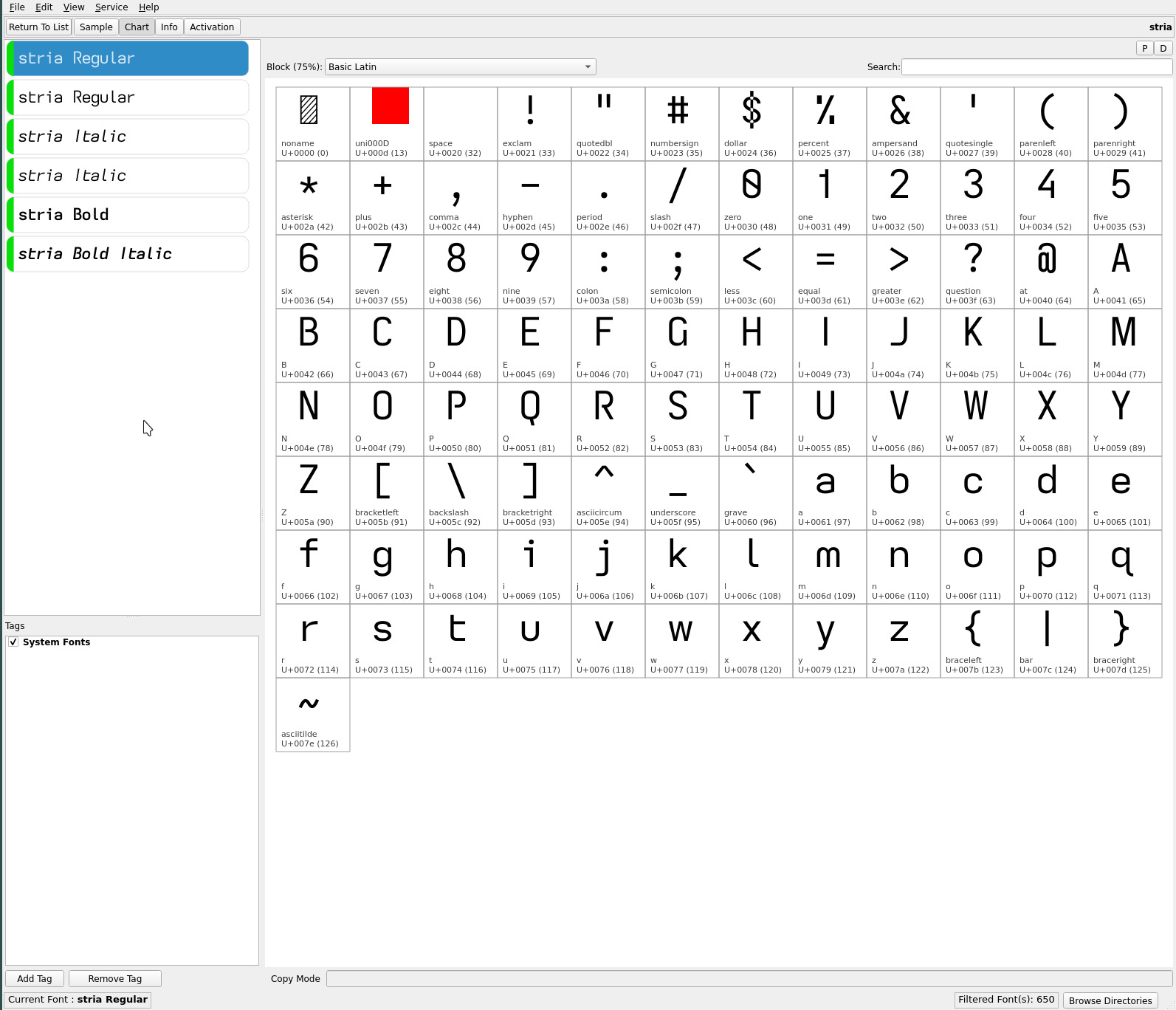
the stria
variant of the groot font completes the “flattened” trio of lower case asymmetric t fonts—with its short parallel striations—adding the classic serifed serifless capital I to complete the font set for a range of printed materials..

repos
The current ereader fonts—including the asymmetric t variants—may be found on OneDrive.